
It’s been almost two years since Fourcast launched. I thought it’d be fun to look at how much it’s changed since then, and talk about how it’ll change soon.
Fourcast started out looking quite different.
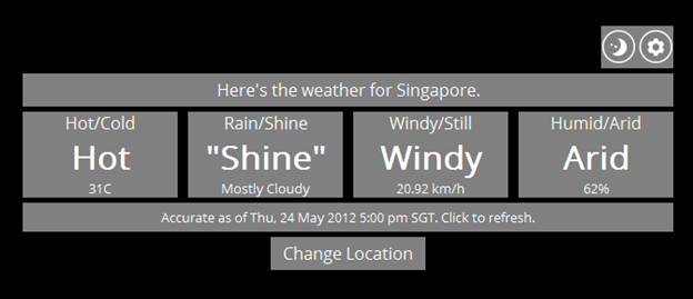
4-bit Webther1 was Fourcast’s predecessor of sorts - a simple website that broke down the weather into the same four components: temperature, condition, wind, and humidity. It used Yahoo! Weather for data, and adhered pretty firmly to the Boolean nature of each “bit”, except for Rain/Shine (which had five values: Rain, Snow, Shine, “Rain”, and “Shine”.)
Fourcast came about shortly after completing 4-bit Webther. I wanted to build something for Windows Phone, but had no ideas apart from just porting what I’d just finished. It was carrying on the tradition: 4-bit Webther itself was a port from a C# desktop app to the web, since I wanted to build something in JS and had no other ideas.
I decided to drop Yahoo! Weather and use Weather Underground’s data instead, since at the time there weren’t any other weather apps on Windows Phone which used it. The initial mock-up looked like this.
It was basically just a copy of the 4-bit Webther UI, vertically-arranged so it’d fit the phone’s portrait orientation. It’s kind of cringey to look at now.
The first working version to actually retrieve data (instead of just display hard-coded values) wasn’t much better.2
If I recall correctly, the main reason I arranged things in this grid was because I couldn’t get the vertical arrangement to fit horizontally in landscape. Landscape support got dropped along the way, but the grid stuck.
At this point there still wasn’t a whole lot going on. There wasn’t a way to search for locations - the weather data wasn’t hard-coded any more, but the location to look up was. You were only able to see the conditions right now, which wasn’t very useful on its own.
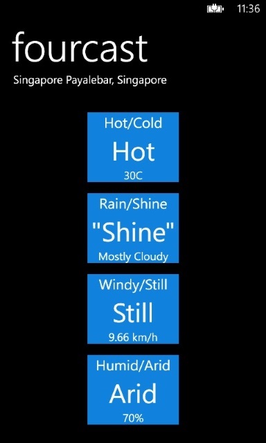
The coloured background of each box actually stayed in for quite a while, even as the rest of the design changed. It used the phone’s accent colour, which I thought was an easy way of adding some variety to the look. Whenever I showed the app to someone, though, they’d invariably end up tapping on the boxes to see if anything happened. I dropped the colours, and the tapping stopped.
Almost a month after that, Fourcast launched on the Windows Phone Store. It started off with a version number of v0.2, the unreleased work-in-progress versions making up “v0.1”.
The headers were replaced with more informative (and general) text, and things were laid out a little better.
Things looked the same for two months, until I received a request to add the Dew Point to the Humidity box. While doing that, a couple of other changes ended up being bundled in at the same time, making v0.6.
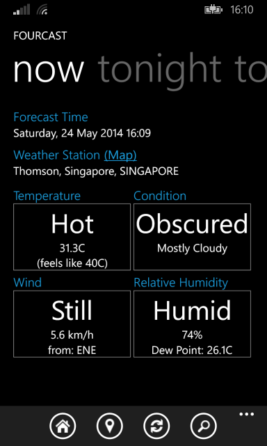
The dew point slotted neatly beneath the relative humidity value, making it fit in more with the other three elements. A little link that brought up a map of the weather station’s location was added, and the search icon was changed from a globe to the standard magnifying glass.
The “later” forecast tab also became “tonight”. I noticed that the time for that forecast seemed to always be 11 PM, and thought it meant the forecast was for the evening; the change was because it wouldn’t have been “later” if you looked at it past 11 PM. This in itself was a misunderstanding, though we’ll look at that a bit later.
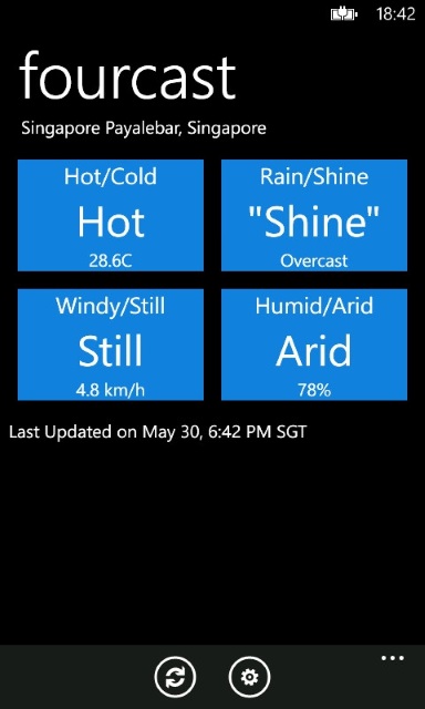
Just over a year later, v1.0 shook things up a little.
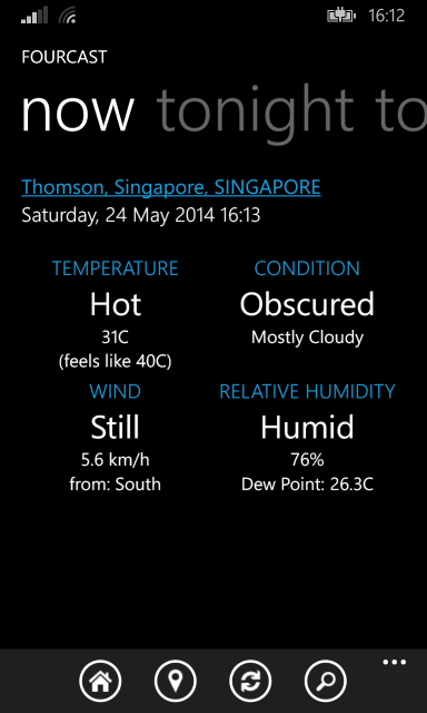
The white border on each element disappeared. I didn’t think they added much, and they started to seem a little out of place. Inspired by the Battery Pro+ app, the headers became capitalised and centred - I’d been toying with capitalising them before, but hadn’t figured out how to do it in a way that looked okay.
The “Forecast Time” and “Weather Station” headers were also cut. I figured they weren’t actually necessary, since seeing the information on its own would be self-explanatory. (I didn’t yet think the same of the headers for each element.) Since station names could get pretty long, I couldn’t just place the “(Map)” link next to them as it might end up appearing off-screen; this was why it ended up next to the header in the first place. The easy solution was to just make the station name itself the link.
The goal was to make things look cleaner and, as a result, nicer. I don’t know how well the latter was achieved, though I did like it enough to actually go and release it.
Fourcast v1.2 may end up being the last version to support Windows Phone 7.5/7.8, assuming I don’t accidentally introduce any bugs which completely break things. It wouldn’t be the first time.
There are a couple of things I’d like to improve before leaving this side of the platform behind for Windows Phone 8. Tiles are one; the UI is another.
Fourcast’s been entirely textual up until this point. I think in some way that adds to its simplicity, though I’d been wondering if it might look better with some simple icons.
It came close to looking like this.
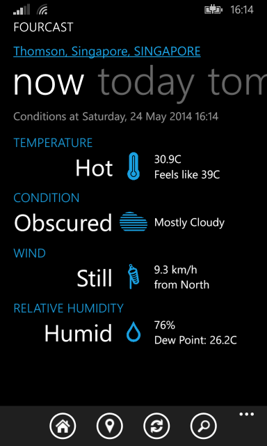
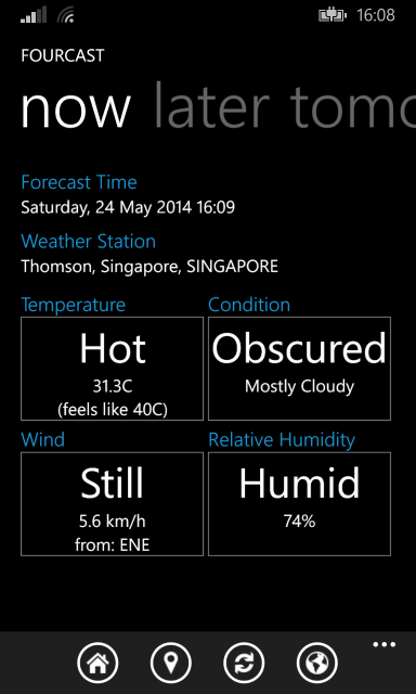
The weather station is now above the forecast pivot - it seemed silly to have it scroll off and on again when you changed the date. There’s also some text leading in to the forecast date and time, which feels more pleasant than just dumping the information there without context.
The second forecast’s label has changed yet again, from “tonight” to “today”. I’d been misinterpreting the data Weather Underground was giving all along - the time portion of future forecasts isn’t actually relevant at all; only the date is. As with the last time, the only change here is to the label itself.
I did like how the headers spaced things out, but they also end up obstructing things somewhat. They were originally in 4-bit Webther to illustrate the Boolean, either-or nature of things, and stuck around because things looked out of place without them. I think we’ve gotten to the point where they can be removed without loss of any information, and the coloured icons prevent things from looking plain without them.
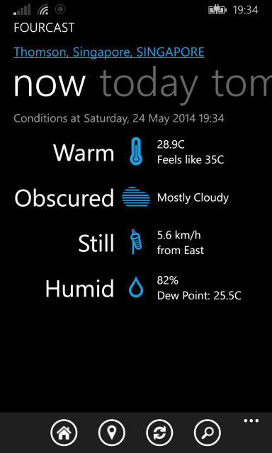
With them gone, it’s possible to just scan down the entire column without being interrupted, and things are a little more compact. I might end up tweaking the spacing a little, but I’m happy with the way this looks for now.
-
I’ve left 4-bit Webther up here, though it doesn’t work any longer. The Yahoo! Weather API changed sometime after it was done, and I didn’t feel like fixing it. ↩︎
-
Seeing the misaligned “Last Updated” line really bugs me now. Alignment in general wasn’t something I thought about until actually looking over the Windows Phone design documents, and now I can’t avoid looking for it. ↩︎