
Update (2020-04-19): 4-bit Webther is no longer available; the Yahoo! Weather API is no more. The links to it here have been removed, but the remainder of the post’s text has been left untouched, as self-indulgent as it is.
This is basically my attempt at rationalising why 4-bit Webther looks and works the way it does - I have no experience with web or UI design, so this is pretty much just for fun (and highly subjective – “this looks terrible; kill it with fire” is an entirely valid response.)
Introduction
Because Headings Are Cool
4-bit Webther was built for a few reasons. I’d already done most of the background code for it in C#, though none of that ended up being used – this left me with a mostly functional application that wasn’t really useful (as I don’t think a whole lot of people would bother downloading an actual application just to check the weather.)
Still, I liked the idea and wanted to complete it. I also wanted to fiddle with HTML and CSS; ISAAC is currently using dat.GUI for its user interface, which is functional but not necessarily the best UI for that application. Building a better UI with HTML is something I wanted to explore.
The main idea behind 4-bit Webther is the “glanceable” forecast – an idea that originates with a classmate of mine. The weather is broken down into four key components: temperature, whether it’s rainy out, if it’s rainy, and if it’s humid. The original concept has these components as simple binary bits: hot/cold, rain/shine, windy/still, humid/arid – these are still around, though rain/shine has grown to become a 5-bit field in itself.
Rain/Shine can currently take on one of five values: Rain, Snow, Shine, “Rain”, or “Shine”.
A Wild Table Appears
| Value | Displays During |
|---|---|
| Rain | Rain, Thunderstorms |
| Snow | Snow, Sleet |
| Shine | Clear skies in the day |
| “Rain” | Hurricanes, Tropical Storms, Freezing Rain, Hail |
| “Shine” | Tornados, Dusty/Foggy/Cloudy skies, Clear skies at night |
The original idea boiled down to “rain” or “not rain”. The current implementation gives a little more variety, and attempts to be a little more accurate without overcomplicating (defeating the purpose of the application.)
Main Page: The Forecast
I’m a big fan of Microsoft’s Metro design language, though 4-bit Webther doesn’t really follow it; I didn’t look up any of the principles or guidelines, though I did follow the mantra of “content not chrome”. Originally there were rounded corners on all elements, but they didn’t really add anything and were hence dropped. The UI as a whole is rather basic (mainly because I have virtually no experience with HTML), which I suppose suits the application: a fairly basic, gimmicky type of thing.
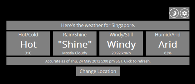
From top to bottom, there are five main components on the main page: the settings bar, location bar, weather forecast elements, forecast time, and the Change Location button. Not shown here is the page footer, which attributes weather data to Yahoo! Weather.
Originally, the settings bar was a fixed element at the top right of the page – the vertical mirror opposite of the page footer. It seemed natural to stick it there (copying the Reddit Enhancement Suite’s bar) at first, though I realised it was a bit out of the way and easily overlooked (especially since unlike reddit, 4-bit Webther has absolutely nothing at the top of the screen.) It ended up where it is (with bigger icons than the original implementation) so it’d be more accessible and visible to users – being right-aligned and kind of sticking out would hopefully catch people’s attention.
The location bar serves the purpose of letting people know just what location they’re viewing the weather for. Straightforward and simple enough.
The weather forecast elements originally had a solid grey background to them, with no gaps. The gaps were added in (thanks to the 960 Grid System, which made layout a lot easier) to make things look a little less monotonous (and also I suppose to emphasise the idea of there being four parts to the forecast.)
(As an aside, I just realised “Fourcast” could actually be an alternative name for this thing, though it’s kind of lame. Moving on…)
I wanted there to be an easy way to tell what time the weather data was generated (according to the Yahoo! Weather feed), as well as a way to update it. The forecast time bar serves this purpose, though it’s admittedly not as good as it could be – it shows when the feed data was generated, but not when it was retrieved (and hence the user has no idea if, after they’ve clicked to refresh the weather data, the refresh went through.) I couldn’t figure out how to include both the forecast time and retrieval time without overcrowding.
I didn’t want a separate refresh button, since it seemed like it might clutter things up. Having the user click on the forecast time to refresh the weather seemed logical.
The Change Location button was originally another bar underneath the forecast location. That seemed to break the flow from top to bottom: you’d read where the weather was, then see that you could click a bar to refresh it, then see the actual weather. Moving it to the bottom and making it a standalone button draws attention to it without getting in the way. (A possible alternative would be to make clicking the forecast location bar serve the same purpose, but that might again break the flow if there was text to explain it.)
The UI as a whole is centred in the page horizontally, and offset from the top vertically. Being left-aligned made it feel weird, and placing it in the centre of the page also felt off: even though it was exactly in the centre it looked like it was too low down. Visual illusions are strange like that.
Settings Pane
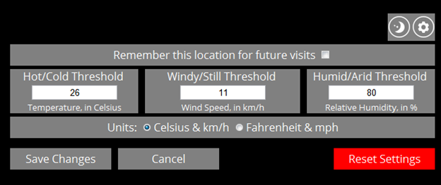
The layout of the settings pane was supposed to directly mimic and map to the layout of the forecast pane – the idea being that if you wanted to change a setting that affected an element on the forecast pane, that setting should be in the same position as that element.
This worked fine for the “remember this location” checkbox, but not so much for the various thresholds: there are four forecast elements but only three configurable thresholds (Rain/Shine being a component that can’t be adjusted). Still, the location of the three threshold “configurators” are in roughly the same position on the screen, and appear in the same order that the actual elements do.
The Save Changes and Cancel buttons were originally centred below everything else (just as the Change Location button on the forecast pane was), but that had to change with the addition of the Reset Settings button. Reset Settings basically nukes the localStorage object used to store settings, resetting them to the defaults, before refreshing the page – there’s a confirmation prompt that appears before it does this, but I wanted it to be very clear that this was a pretty different button than the other two (hence the red colour and it being way off there on the right.)
The gap between the three buttons and the elements above them is also bigger than usual; the idea being to make it clear that these are buttons that will get you off of this screen, and also to try draw attention to them. With a smaller gap the buttons risk blending in to the mass of grey that makes up the rest of the pane (though the bright red Reset button does still stand out.)
Change Location Pane
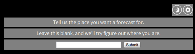
Really not too much going on here, as this pane needs to do only one thing. I didn’t include a “Cancel” button since I kind of cheated here: this pane is displayed when the user wishes to change location, and also when they either deny or ignore the web browser’s request to access their location (i.e. when HTML5 Geolocation fails.) The ability to cancel out of this page makes sense for the former, but wouldn’t in the latter – there’s no usable state that we could go to.
(The Settings Pane has some logic to return the user to the last visible pane they were on, precisely to avoid sending them to an unusable state: if it were to simply send them to the forecast pane after they toggled out of settings, it would be possible to have geolocation fail, click into the settings pane, then click out and be sent to a blank forecast.)
It’s definitely possible to determine the condition under which this pane is being displayed (because the user clicked the button, or because geolocation failed) and show or hide a Cancel button depending on which, but that seemed like it would add complexity that isn’t overly beneficial. Little things like that do make the user experience better, though, so I suppose it’s still worth the effort.
Conclusion
4-bit Webther was fun to work on, even if the end result has little practical use – there are full-fledged weather sites with better data, and I still prefer the method of finding a window and looking outside (though I still like the “glanceable forecast” concept). Ultimately it served as an experiment to learn from: it let me play with things like HTML5 Geolocation and Local Storage, and try creating some sort of a UI with HTML, CSS, and JavaScript. It’s a rather basic application overall, but it does do everything I wanted it to do from the start.
ISAAC definitely won’t be getting a UI like this, though – the style doesn’t fit, and the HTML seems a bit messy. More exploration is needed.