
Windows Phone 8.1’s been out in near-final state through the Preview for Developers program for about three weeks now. Though there’re a lot of new features and changes, I’m not going to go over all of them in detail; by now there are loads of other articles and posts available which would do a much better job. These are just my thoughts on things I came across.
I’m not well-versed in the subtleties of either Android or iOS in their current state. The last version of Android I used was either 2.1 or 2.2 in unofficial-ROM form (on a device which was a flagship phone before the Nexus One dumped it into the mid-to-low-end category), and I haven’t used iOS on a phone at all. Many of the things that are new in WP8.1 may very well have been introduced to them a while ago; I wouldn’t know, and I’m not claiming any platform is better or worse than the others.
Let’s talk about the developer preview program first. It uses the regular (I believe) Windows Update-based mechanism to actually deliver the update, but it’s not the same as the version you’d get with a new device or by waiting for manufacturers to officially release it. It’s near-final code, and it’s just the OS update alone without any hardware-specific firmware updates that manufacturers might include.
It seems most people who tried did manage to update without any issues, though it didn’t work out as well for me. Wi-Fi and mobile data didn’t work afterwards, which was only resolved by hard-resetting the phone, wiping everything from it. Signing back in automatically restored my apps and text messages from the cloud, though apps didn’t have their data backed up and I had to redo my Start screen layout.
Funnily enough, app data and Start screen layouts are now both backed up to the cloud in WP8.1.
Once everything was back up and running, my first impression was that it felt kind of strange. It’s not like changing platforms and having to get used to moving to an entirely new device and OS: the core look and feel hasn’t changed, and most things work the way they used to. Having new features be simultaneously familiar but foreign caused a kind of disconnect - they weren’t things I had before and so they seemed out of place, but they didn’t look or feel like they didn’t belong.
There was one thing that did require relearning, which contributed to the “familiar but foreign” feel. Previously, notifications could be told apart by the way in which the phone vibrated when they triggered: SMS used a single, long pulse, emails triggered two short pulses, and apps fired off a medium-length pulse followed by two quicker ones. When my phone was on silent, I used to determine if something was worth checking based on that vibration pattern: SMS, apps, then email, in decreasing order of priority. Everything now uses the medium-quick-quick pattern, so there’s no longer a way to tell things apart by feel alone.
The reason for this change is probably the unification of notifications into the new and long-awaited notification centre. It shares the name - Action Centre - with its closest equivalent feature in Windows, though its namesake there is only really for certain system messages. It’s essentially the same “window shade” that Android pioneered, listing all notifications after being dragged down from the top of the screen. This was the only real thing I missed from Android, so it’s really nice to finally have once more.
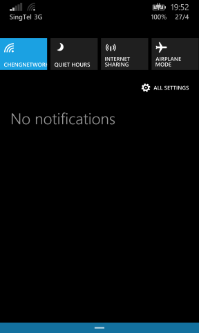
I like that the battery percentage is displayed when you start to bring it down, which let me do away with an app I had pinned to Start just to display that. I can also see it without having to unlock the phone, which is great.
A nice side-effect of all notifications being unified is that any notification at all, regardless of source - individual apps, email accounts, or SMS - can now be customised from within the OS’ settings. That means the ability to toggle the pop-over toast notifications, vibration, and sound on a per-thing basis. Even better is the ability to choose custom notification tones for everything from one place, which I really like: I’ve got different tones for each email account now, and it’s finally possible to audibly tell which app has triggered a notification.
The last update to WP8, Update 3, gave developers the ability to specify custom notification tones, which in theory would allow the same thing to be done from within the app itself; in reality, few apps bothered at all. Out of all the ones I use, only the Facebook app (made by Microsoft themselves) used a custom notification tone, and didn’t let users customise it. That’s no longer an issue now, and it also removes the need for developers to spend time on custom notification pickers.
Though as mentioned, it’s not like much time was spent on it before.
The Action Centre was easily the thing I was most looking forward to in this update, and it did thankfully live up to expectations. Though there are APIs for apps to write and remove entries silently, out of the box any toast notification just gets stuck there under an app’s own header; it works without the need for apps to specifically support it, as it should.
Something else I was looking forward to was the ability to display more tiles on the Start screen. When WP8 Update 3 came out, it brought support for phones with bigger screens: if your phone had a screen larger than a certain size, a third column of tiles would be displayed on Start, making it three medium tiles (six small, or two-and-a-half large) wide. That meant things wouldn’t look huge as they would with the standard two-wide layout, and you’d be able to have more tiles available at once.
WP8.1 lets you turn this feature on and off on smaller devices like mine, though it can’t be disabled on the larger ones. In a previous draft I’d written about how I found things too small and ended up leaving it off; I’ve since tried putting a little more thought into laying things out, and came up with something which I think works well.
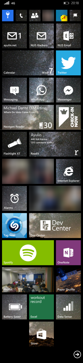
(The Battery Saver and Data Sense tiles actually do display the actual battery level and signal strength - I just didn’t take that screenshot at the same time as the top-most one.)
I’m still kind of on the fence about this one, but it’s definitely growing on me now that I’ve found a layout I like. At the very least, it’s nice to have the option available.
As an aside: it’s kind of ridiculous how large some phones are getting these days. When I got my Lumia 920 (with a nowadays “small” 4.5-inch screen) the first thing I thought was “wow, this thing is huge”.
Times change and all, but still. There’re also ridiculous screen resolutions on some devices too: full-on 1440p. On a phone. 600+ DPI. Seriously?
I’m almost convinced things like that are just so manufacturers can show off, and less about there being any tangible benefits for users.
I didn’t initially understand the fuss over being able to set a background image that displays “behind” the tiles - the tiles act akin to window panes looking in on the picture you chose, with a parallax effect when you scroll through them - though it really is quite slick. It goes a long way towards making things feel fresh again after having all the tiles be just a single colour for so long.
I also didn’t really think Cortana was going to be as useful as it turned out to be. It’s only officially available in the US, though changing the phone’s region and language will enable it. A whole lot of things fall under its purview, which turned out to include my second most-anticipated feature: Quiet Hours. It’s essentially Do Not Disturb from iOS, and disables any and all notifications - incoming calls included - while active. You can also specify an “inner circle” of contacts who get let through any time they call or SMS when it’s enabled, and optionally have it automatically SMS anyone who gets rejected to let them know you’re “busy”. I think it’s better to leave that abstracted away from anyone trying to contact me, so I left it off.
I also manage to constantly forget I have it set to automatically trigger at night: I’ll be sitting at the computer just after it turns on and wonder why I stopped receiving email or Facebook message notifications. You can also have it trigger during calendar events marked as “busy”, though I opted out of this after it lead to inadvertently ignoring a classmate during a lecture. This wouldn’t be an issue if everyone still used SMS (since inner circle contacts could break through), but chat apps like WhatsApp or Facebook Messenger don’t have that option and get blocked entirely. That’s one place I’d like to see improved, though it’d require both the ability for apps to hook deeper into the OS’ contacts system and for developers to actually bother to do so.
Cortana also does something rather subtle which I thought was pretty cool: things which look like a date or time in SMS or emails get underlined, and tapping on them brings up the ability to add them as a calendar appointment. It’s fairly good at detecting timings, with explicit date/time combinations working as you’d expect, but also picking out things like “tmr 8pm” and even named events like “Mother’s Day”.
Reminders (and in particular, the location-based ones) are something I found really useful, and which I actually use the voice recognition for. It’s really convenient to use voice, and though it might not necessarily be quicker than doing it manually, it does need a lot less effort.
Voice is a little awkward to use in public, though, so I end up just typing out the same thing instead - anything that can be done by voice can be done by typing, which is nice. Since the keyboard now has gesture/shape-writing (or whatever it’s called) too, that’s fairly quick as well.
I remember installing the Swype beta when it first came out onto my HTC Hero, and not being convinced that it was any faster than typing. My conclusion back then was that it was definitely superior if you were only able to use one hand, but if you had both hands available typing normally would beat it. Now that I’ve tried swiping a little longer, I’m not so sure.
Swiping does seem much quicker than tapping things out character-by-character, but it also means you’re entirely reliant on autocorrect. When it works (which, granted, is most of the time) it works really well, but it’s not as easy to recover from mistakes as when you’re typing. If it’s a simple incorrect prediction it’s fairly easy to resolve - tap and choose the correct word - but the “false start” where I realise I started off swiping the wrong letters brings everything to a crashing halt. There’s a pause when the realisation sets in, then the time taken to delete the entered characters. I’ve started to just “blindly” swipe the entire sentence out and correct mistakes afterwards, which has helped a lot there.
Two other changes to the keyboard I thought were worth mentioning: you can select a word then tap shift to rotate through capitalisation (lower, Upper, ALL) which is very nice, and autocorrect now suggests emoji, which is kind of amusing.
New features weren’t the only thing WP8.1 brought, though: there are also a couple of ecosystem-related changes which I thought were interesting. The first was the introduction of so-called Universal Apps. The Windows Runtime introduced with Windows 8 is now also available for the phone, which lets developers easily build apps for the two platforms. That was possible before, but not exactly in the same way or to the same extent as Universal Apps allow.
You could package common code that would run on any platform into libraries that could be reused, but that was basically it. Universal Apps let you share assets like images and even entire pages of the UI. Instead of having two entirely separate projects which depend on some common libraries, you can now have a single project that targets both platforms, with a shared common core base. 1
It’s not quite “write once, run anywhere” (nor should it be, with there being platform-specific traits that should be handled) - but it is “buy once, run anywhere”. Users can buy (where here “buy” also refers to free apps) an app on their phone and get a license to the version which runs on their PC, or vice versa. And that’s really, really cool; I’ve always liked the idea of being able to do something on your computer and pick up where you left off on your tablet or phone. 2
A perhaps less-mentioned change was the relaxation of the platform’s hardware requirements. When “Windows Phone 7 Series” was first announced years ago, one of the larger pull factors it had (to me) was the idea of a standardised hardware base: a set of strict, minimum requirements that all devices had to meet.
I really liked the idea. It seemed to be a good blend between the uniform experience that Apple offered and the large hardware diversity Android had: pick from a selection of devices (like Android) and get a guaranteed baseline experience (like the iPhone) regardless of your choice. Apps would run on anything, and they’d run with decent performance - something which wasn’t the case with my Android phone - and this was true for quite a while.
There are a number of reasons to relax hardware requirements. One would be to allow new types of devices - the low-RAM spec introduced with WP7.5 is a great example of this. Though it introduced tangible restrictions to the user experience (apps couldn’t run background agents, and memory restrictions meant some wouldn’t run and were hence prevented from even installing), it also opened up the low-end market to the platform. Even today, low-end devices are the best-selling Windows Phones globally. 3
Another is linked closely with the previous reason, but is also likely to be the relevant one for our current situation: to court manufacturers and make it easier for them to build Windows Phones, with the underlying premise being “if it’s easy they will come.” The latest change to the hardware requirements drops almost all the buttons: Start, Back, and Search can now be provided by the OS the same way Android does, as soft buttons displayed on the screen, and so they aren’t required to be done in hardware (either physical or capacitive). The camera button on the side is also made optional, leaving power and volume up/down left as the only hardware button requirements.
Taking all the buttons which were unique to the platform and making them optional makes it easier for manufacturers to take their Android-running hardware and stick Windows Phone on it instead 4, which is probably what Microsoft’s going for - the more hardware choices the better, right? Losing the camera button kind of stings, though; I’m sure any phone which wants to tout imagery as a key feature (like, say, the Lumia 1020’s hypothetical successor) will include one, but it’s not guaranteed any longer. It also means losing the ability to wake the phone straight to the camera, which is really handy.
The bar’s been lowered, but I’m curious as to how many will try jumping.
-
To be more accurate, it’s actually a single Visual Studio solution with three projects: one targeting Windows, one targeting the phone, and the shared common project. ↩︎
-
This is something web apps purport to do, but I don’t think any have really achieved it yet. (I also have other issues with relying too much on the web, which is perhaps a better topic for another time.) ↩︎
-
The low-end experience also isn’t as tough today. Windows Phone 8 bumped the minimum spec to 512MB of RAM (the same amount which was “high end” for Windows Phone 7), dropped the ban on background agents, and lowered (but kept) the memory restrictions. I think some games still won’t install or run on low-end phones, but having background agents is a huge win since you aren’t losing functionality from the things you can run. ↩︎
-
Okay, it’s not exactly that easy. You’ve got drivers to write and many other things to do and test, though it is theoretically possible now. ↩︎